Chappy Tabby’s brand logo design (December, 2019)

Concept
Design for everybody’s happiness (by consolidating logic and creativity)
Main Keywords
- happiness <- cat (‘Chappy Tabby is named after my family, Chappy the brown tabby)
- peace
- creative / expression
- discovery
- myself
The intention of this logo design
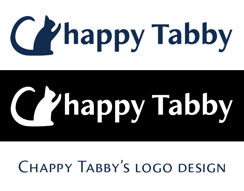
A cat’s silhouette raising one hand like high-five, means greeting to, praising others.
It’s hand is going to touch the letter ‘h’, the first letter of the word ‘happy’, also a part of my name ‘Chappy’.
This cat’s tail shapes similar to the letter ‘C’, the first letter of my name.
It means that I can make something happiness.


I found that cat’s tail is like ‘C’ when I drew these sketches 😺
Logo’s color is derived from previously published my portfolio website’s primary color because it gives a calm, intelligent and logical impression.
First I only made symbol logos, but I realized that it is a bit difficult to use if I don’t have logo with typography.
So I combined a symbol and typography of my name.That is a complete logo design.


